
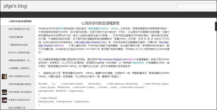
所以若讀者要調整或閱覽此類型態的部落格,最好用這樣的 http://xxxxxxxx.blogspot.com/view 的網址於各種瀏覽器,免得氣死。以上所列之各項缺點,都需要Google進一步的調整。以下是根據Yogaratnam N.等建議的CSSs,進行更改「動態瀏覽(Dynamic Views)」的外觀所做之紀錄,或可供有興趣的使用者參考。
1. 這是就全部七個「動態瀏覽(Dynamic Views)」整體所做的調整:改變前五組編碼的其中一項,便會影響到其他「動態瀏覽(Dynamic Views)」外觀的呈現;讀者若有興趣,可以刪除任何其中一項,看看有什麼變化。剩餘的五組編碼,則是進一步就單一瀏覽介面的微調。
#items li, .overview-inner, #content, .item.hentry.selected,  .item.hentry.open, .item.ybyss, #feature, .overview-inner, .column .item, .viewitem-content  {

background: #b38e00 !important;

}

.items.hfeed{

background: transparent !important;

}


#lead .item:hover, #feature .item:hover, #fold .item:hover{

background: #6aa84f !important;

}


#header .header-bar, body, .viewitem-inner{

background: #b38e00 !important;

}


.article{

background: #b38e00 !important;

font-size: 18px !important;

}


.flipcard .back{

background: #b38e00 !important;

}


.flipcard .back .overlay .title{

color: blue !important;

font-weight: bold !important;

}


.flipcard .back .overlay .date{

color: #ff00ff !important;

font-weight: bold !important;

}


.slice p, #content{

color: black !important;

font-size: 14px !important;

}


.column .item:hover{

background: #6aa84f !important;

}
2. 遮掉部落格名稱及搜尋欄。
.title h1{

display: none !important;

}


.header-bar #search{

display: none !important;

}
3. 自訂網頁標題顏色與字型大小的改變
#pages ul li a, .ss.menu-item{

color: yellow !important;

font-size: 16px !important;

}
4. 文章標題顏色與字型大小的改變,及左側欄字型大小的改變
h1 {

color: blue !important;

font-size: 56px !important;

font-weigt: bold !important;

}


h3 {

color: blue !important;

font-size: 16px !important;

font-weight: bold !important;

}
5. 加圖片於部落格的最上方,圖片高度不要超過250px,其他的調整法,請看這裡。
#header .header-drawer.sticky, #header .header-drawer {

top: 134px;

}


#header .header-bar{

height: 165px;

}


#header:hover .header-drawer, #header .header-drawer.open, .header-ssyby, body.viewitem-open #header .header-drawer {

top: 165px;

}


#header-container {

height: 205px;

}


.viewitem-panel .viewitem-inner {

top: 100px;

padding-bottom: 120px !important;

}


#header-container #header.header .header-bar span.title{

background: url('放上自己的圖片網址')

no-repeat center;

margin-left: auto !important;

margin-right: auto !important;

height: 165px;

}
6. 調整版面與文章的的寬度
.overview-wrap{

max-width: 2000px !important;

}


.viewitem-panel .viewitem-content, .classic li.item, .article, .ss {

max-width: 1750px !important;

}
7. 右側欄位字型大小、顏色及位置的改變
.gadget-icons, .gadget-title, .gadget-content, .ss {

background: #6aa84f !important;

color: blue !important;

font-size: 16px !important;

font-weight: bold !important;

}


#gadget-dock, .ss{

top: 300px !important;

}
8. 啟動網頁動畫的改變
.ss,.blogger-gear{

background: url('放上自己的動畫網址') no-repeat !important;

}

0 comments:
張貼留言
由於Google留言系統與Facebook留言系統互相衝突,若先有Google留言,煩請繼續用此系統留言;反之,若先有Facebook留言,請繼續用Facebook留言。